Ancient alchemy ~ from Ochre to Iron Red
Ancient alchemy, San Rock Art, and a childhood spent on red earth. Our newest dye colour, Iron Red, begins not with a mood board or a trend forecast, but with a rock face in the Waterberg and the artists who worked on it thousands of years ago.
Its story starts with Ochre, one of our existing dye colours, and one of the oldest pigments known to humanity. The connection between the two is both scientific and deeply poetic. When yellow goethite is heated, it transforms into rich red haematite through a process called thermal dehydration. The iron oxide pigment that results is the same one that gave San rock art its enduring brilliance, the warm, burnt reds and ochres that have survived centuries of African sun, wind, and rain on stone surfaces across the subcontinent.


The San artists understood this ancient alchemy long before science had a name for it. They sought out rare iron-rich minerals, grinding goethite into a fine powder and combining it with fresh eland blood to create a pigment that would bind beautifully to stone and withstand the passage of time. In the dry African sun, yellow ochres could even deepen naturally into richer reds, a reminder that the landscape itself continues the work of the artist.
Iron Red and Ochre are, in this sense, the same colour at different points in a journey. And it is no wonder that they pair so naturally together, echoing the ancient earth tones of a landscape where these colours have lived side by side for centuries.
Why this colour, and why now, Amanda, on Iron Red
I grew up in a home where colour was treated like a celebrity. Red, pistachio green, duck egg blue. But red was always a firm favourite in my mom's home. She created the most beautiful spaces, artist friends she found, works by up-and-coming artists, and textiles that outlasted all four of her girls in terms of staying power in the home. Colour was never decorative for her. It was a statement.
But the story of red in my life goes beyond the walls of my childhood home. A recent visit to the Waterberg and a visit to a sacred San site reignited my love for this colour.


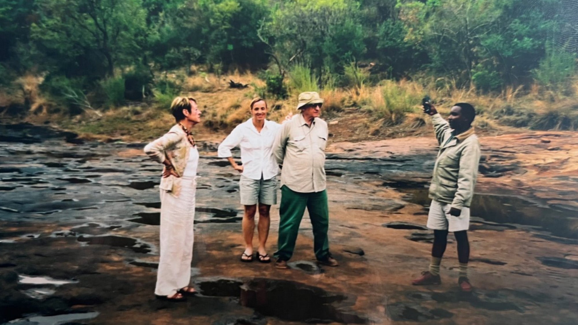
My father owned the farms Kliphoek and Wildeboschdrift in the Waterberg (now part of Lapalala Wilderness). It was the backdrop for some of my most formative memories: red sand, rain on dry earth, long walks to the river, game drives in the early morning, fires at night, sunburnt skin, Cool-Aid mixed with water from the Blokland Spruit. The Waterberg has a particular quality of light and earth that stays with you. The land there is ancient in a way that is difficult to articulate; it simply feels older than most places.
And then there was the San Rock Art
The San paintings that graced the red and brown stones of the koppies were spectacular. Rendered in warm ochre tones, they were extraordinary, figures and animals pressed into rock, carrying the memory of a world that predated everything I knew.


The element of nature has always played a strong role in Evolution, in the inspiration behind our design language. So when we began developing Iron Red, it felt less like an invention and more like a recognition. This colour has always been here. In the earth, in the stone, in the paintings on the koppies of my father's farm and on the walls of my childhood home.
We have simply found a way to bring it home.
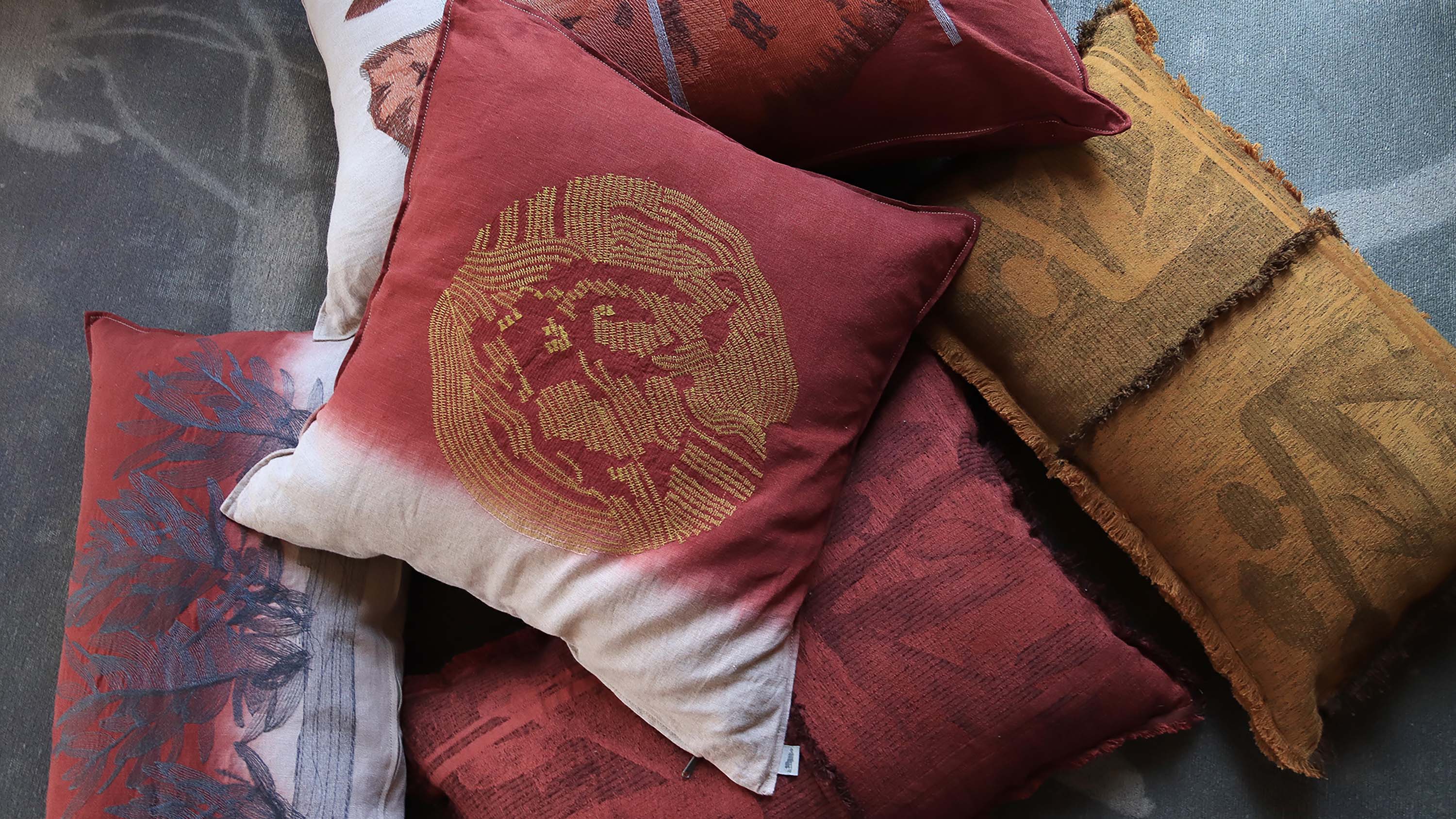
Iron Red pairs naturally with our existing warm tones, Ochre and Antique Rust.
Shop the look here.